So you start a new business…
A business specialising in web strategy & SEO. How do you get across the complete meaning of SEO in your brand identity? That was the question I asked myself… My primary goal is to build websites that are user-friendly, convert & rank well in search engines. That’s how I came up with my tagline “Websites for Robots and Humans”. It’s true, I build/repair user-friendly websites for us humans who browse, surf, research, click, multi-tab, multi-task, watch, listen etc & sites that rank well in search engines who use robots (or web crawlers) to crawl the net and find things organised in a logical manner that their algorithms can deconstruct. Most web development companies will build you a site that looks stunning & might even knock your socks off. That’s well & good but totally useless if you have no visitors because you don’t rank. So I needed to make my point of difference clear… I needed people to see a robot and ask questions like… why do you have a robot as part of your logo?
So the journey began…
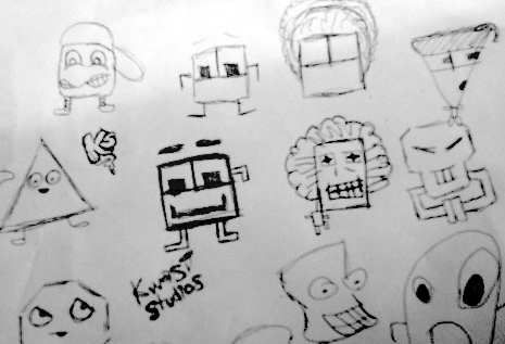
I brainstormed a bit and looked at some sources that I thought were appealing like SEOMoz’s Rogerbot, Google Android and even some street art. I scribbled out some sketches myself and came up with some interesting doodles (including the one below) – it didn’t take me long to realise that I needed professional help!
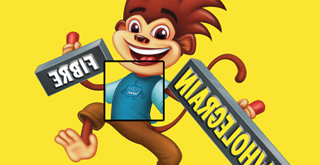
I continued my research, looking at a few local street artists, illustrators, graffiti artists & design agencies until I stumbled accross Mr Anton Emdin‘s fine portfolio. I noticed the small robot he did on the Coco Pops monkey’s T-Shirt (see below) and the style of cartoons he illustrated seemed a symbiotic fit for this little project.
With formalities completed we began working together and the first set of ideas came back based on my brief which in summary was for Anton to create a “World Vision Robot” – a robot who people could empathise with, make an emotional connection, feel a little sorry for (especially since he mostly gets forgotten by those pesky web developers!) & realise that he’s a vital participant in your web strategy.
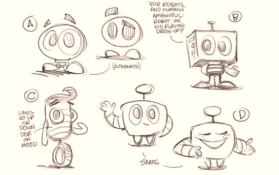
I was impressed with the rough sketches that came through and felt most accustomed to B or D but couldn’t decide so I put it to the jury.. well the Facebook jury. It was unanimous that B was the path to go down. However, I felt that it looked too much like a kid playing dress up. Perhaps it was too much of a hybrid between human & robot so we needed to switch focus to be more of a cyborg nature.
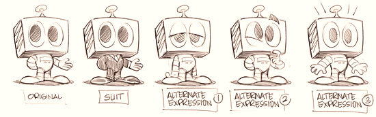
I think we hit the nail on the head… the robot was born & with different poses! This was great as I intend to use the robot in different promotional materials and may need him to have different expressions. Seasonal factors could also influence his attire, e.g. Christmas would put him in a Santa suit, if I wanted to appeal to trades folk I could give him a wrench & some overalls, a full suit could appeal to the corporate audience etc. I was happy with the character & next we needed to lock down some colours & shading styles.
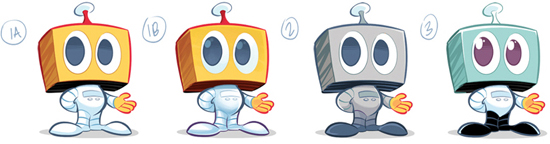
From these options we had to lock down the rendering style (1A uses hard lines of shading, and 1B uses a more painted shading, giving it a softer look), shininess (1A has none, 1B and 2 have moderate shine, and 3 is glossy) & colours. I opted for the shiniest option & decided on a single coloured robot – a metallic looking blue.
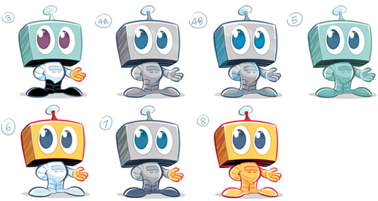
To cut a bit of a longer than necessary story short (some back and forth due with subtle colour modifications – sorry Anton) we ended up going for 4B. I even tried a whole gamut of hues to see different colours but in the end, reverted to the original 4B.
Next we needed to add the text “Kwasi Studios” & tagline “Websites for Robots & Humans” and the following options were sent through:
![]()
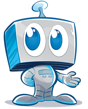
Option 6 stood out the most due to its simplicity and the fact that the text could be used independently of the mascot. The text would also look great in monotone colours and the font style worked well with the tone of my company which is tongue-in-cheek, approachable & friendly. We locked it down and here is the final logo:
![]()
And there we have it folks – an identity is born. I’ve got a brilliant logo to accompany my business on its various marketing pursuits. I’m hoping this little robot guy (who I’m calling Kwasibot until I come up with a better name) will open some doors & help build some trust. I have big plans for him down the track, so stay tuned as he aims to make the web a better place. I have some business cards printed too to help me leave some footprints out there in the real world!
Coming up soon, Kwasi Studios will sponsor Jai’s soccer team for some passive brand exposure 🙂
Please leave some comments, name ideas for Kwasibot or anything you feel like below.

Comments (0)